The Village Company - Assignment Board
assignment Insight
A house of brands only works when each fits within the family, yet has distinct personalities. The Village Company owns multiple personalities under one umbrella, two of which are:
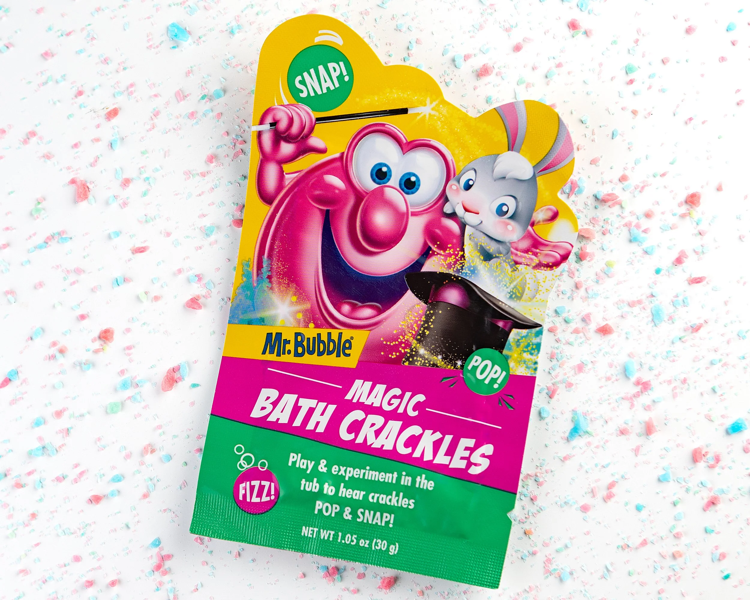
Mr. Bubble - a bath-time icon built on color and nostalgia
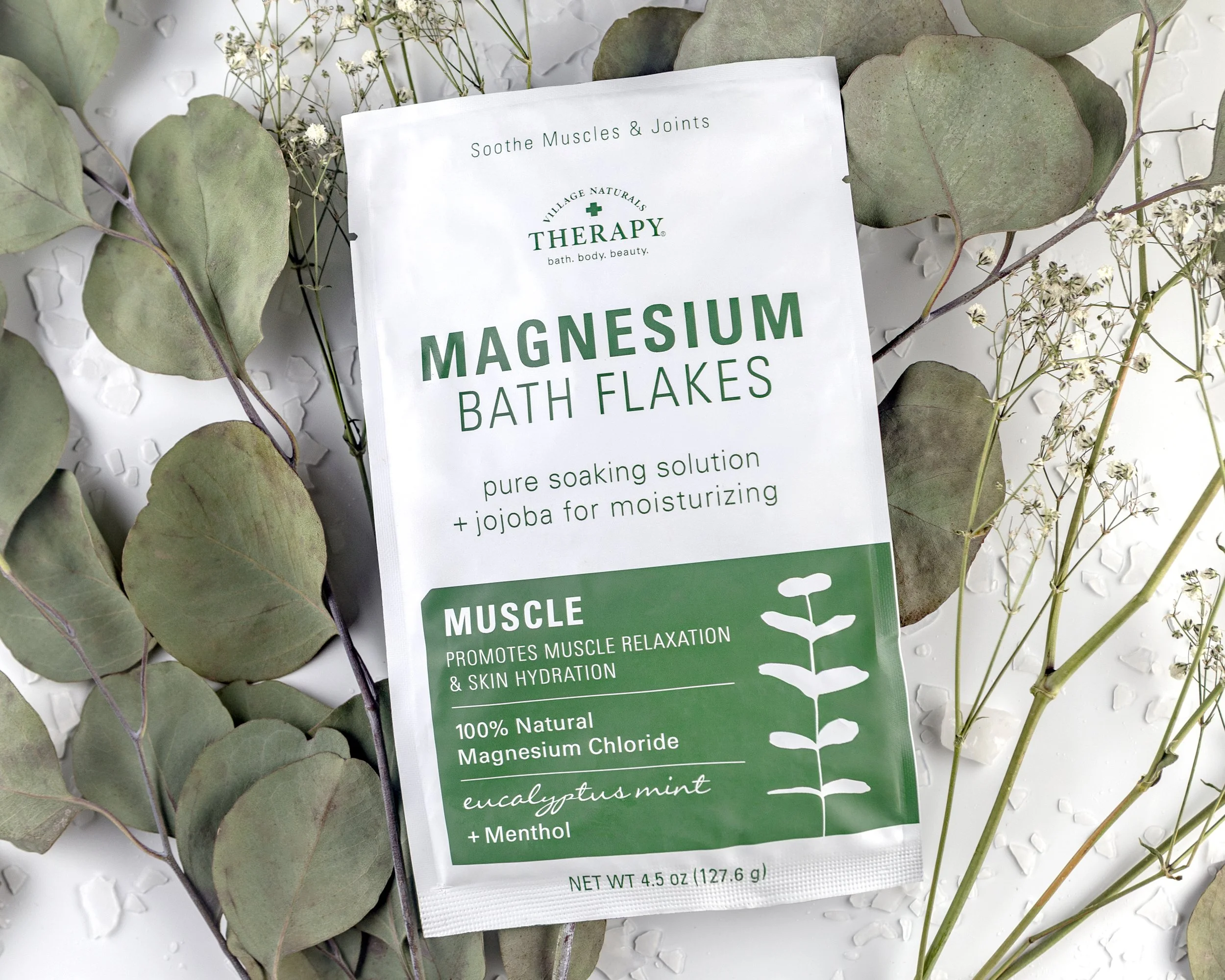
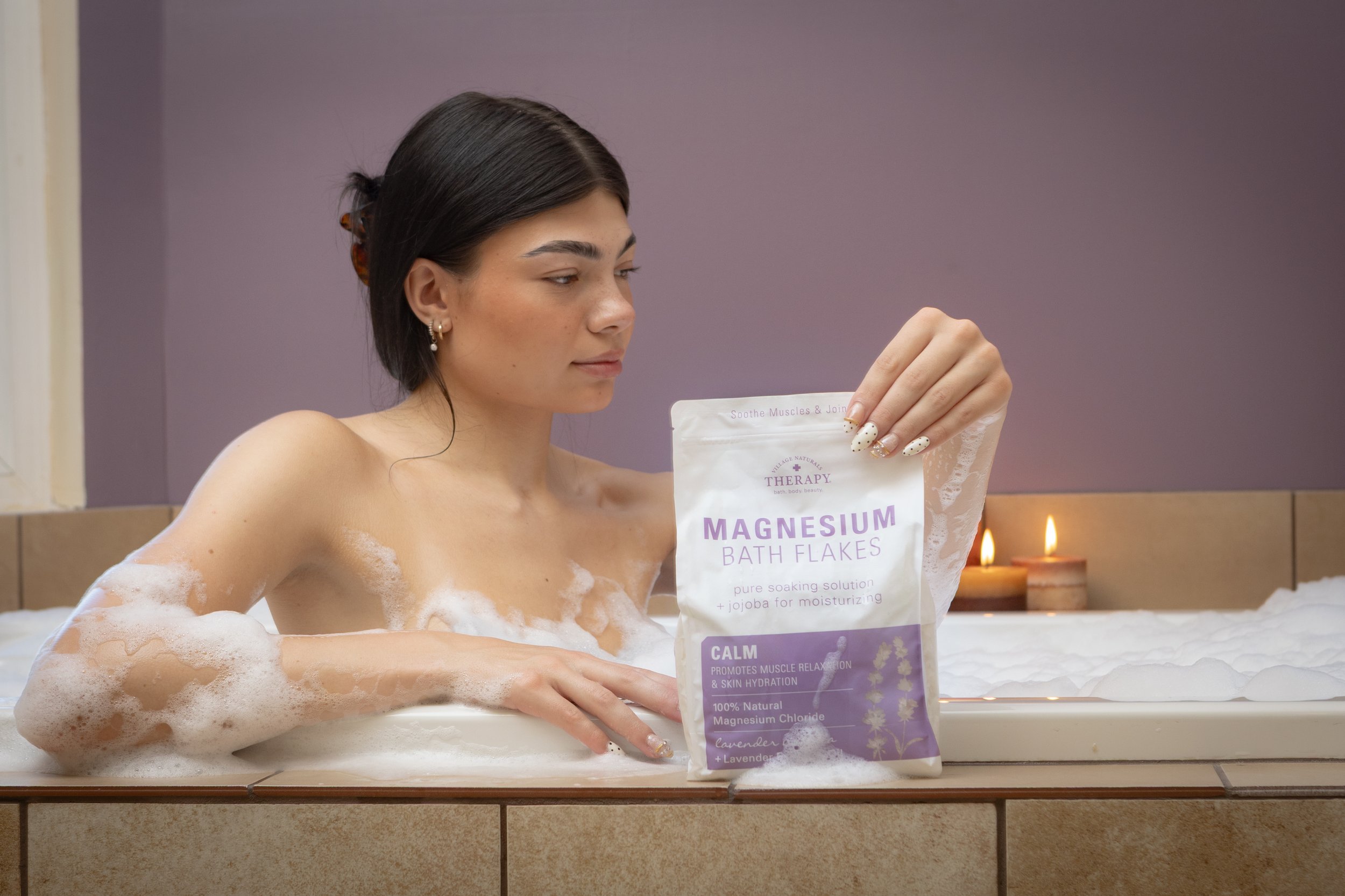
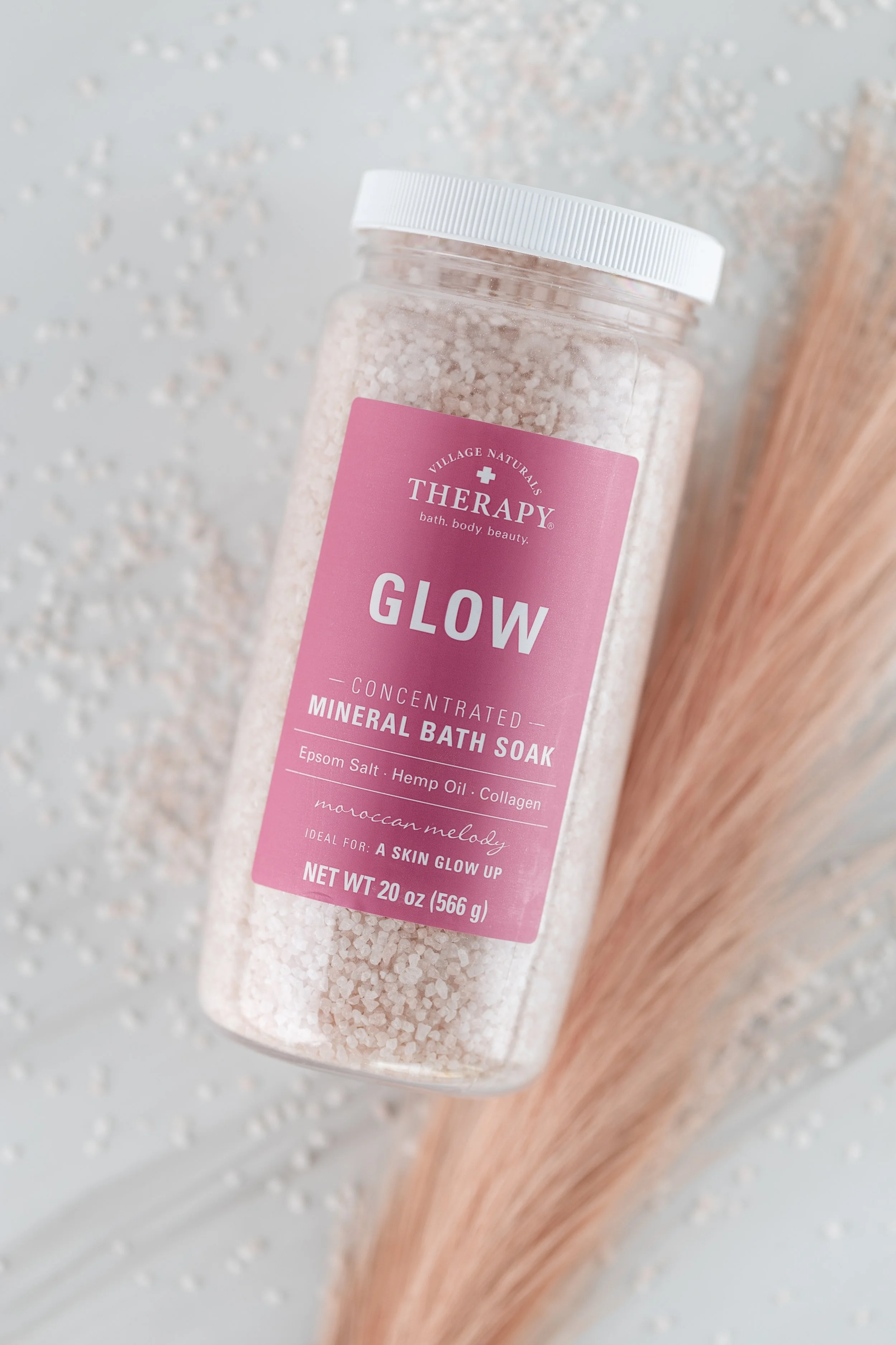
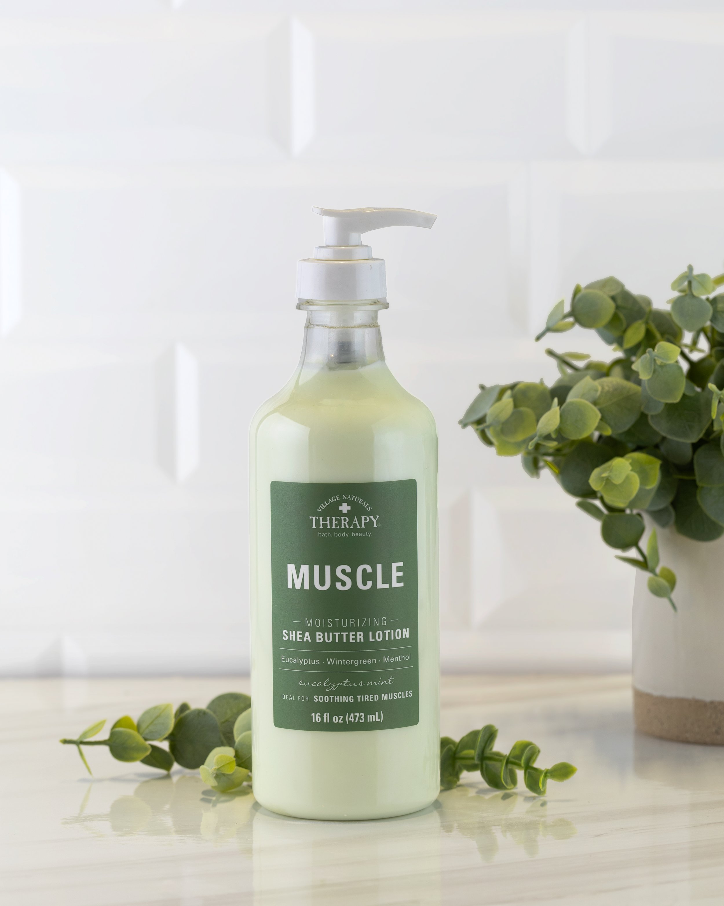
Village Naturals Therapy - a self-care line built on quiet and restraint
The challenge isn't picking one visual language. It's proving I, as the photographer, can create both, on the same day, with the same eye.
Opportunity
The Village Company need a working sample of brand storytelling across formats: an email hero banner and Instagram image for Mr. Bubble, and a promotional digital ad for Village Naturals Therapy. No studio budget, no purchased props, no existing brand guidelines to lean on. Everyday materials, a bathroom, and a clear read on what each brand is trying to say.

Services
Concept Development
Photography Direction
Set Design & Styling
Typography & Promotional Graphic Treatment
Post-Production Editing
ASSIGNMENTS
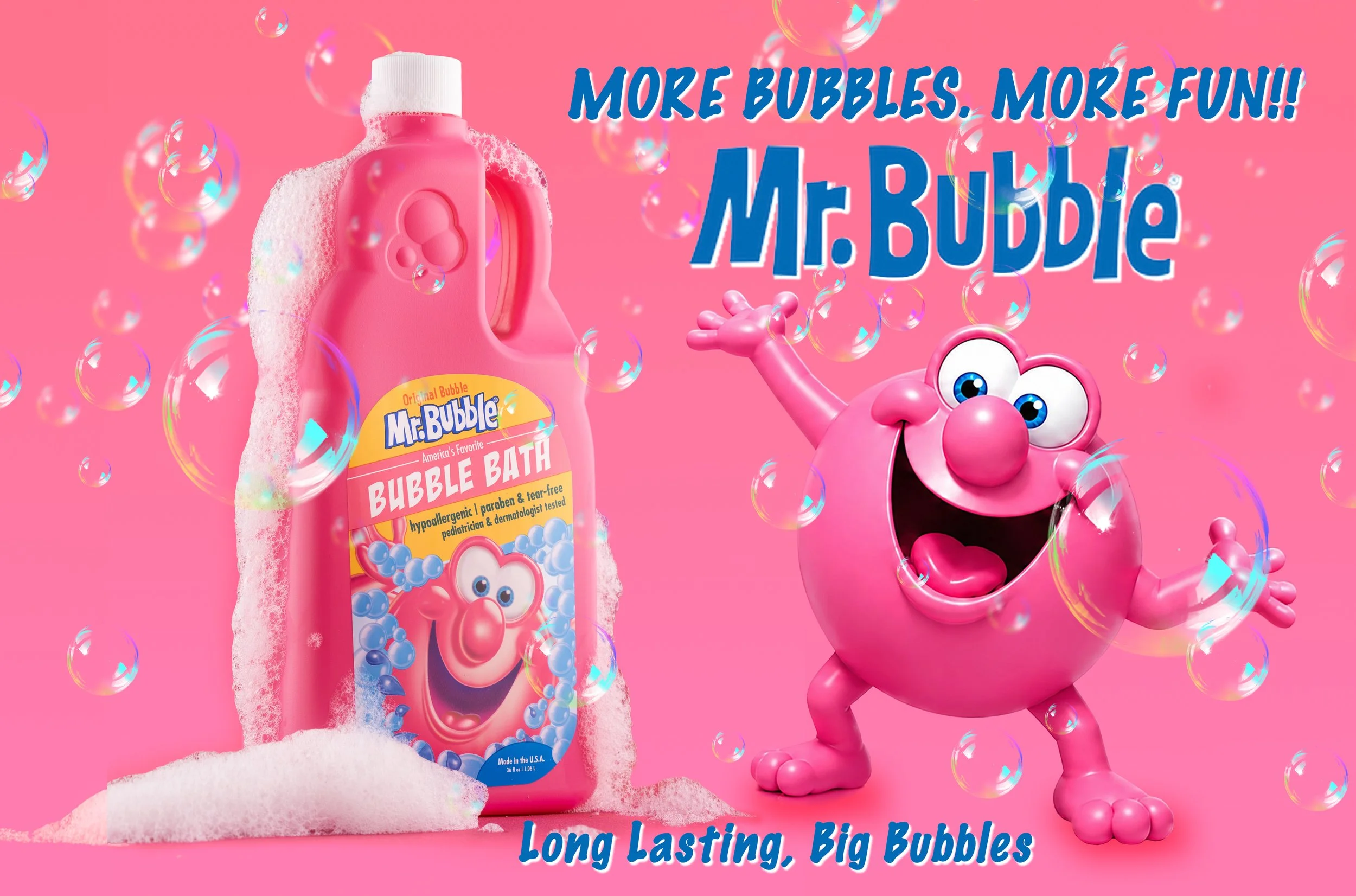
Mr. Bubble: Email Header
Mr. Bubble has always sold energy. Bright pink, mountains of bubbles, a product that turns a nightly chore into a party. The hero banner leans into that: saturated color, directional light to catch highlights on wet bubbles, and a composition wide enough to breathe as an email header while still landing the product front and center.
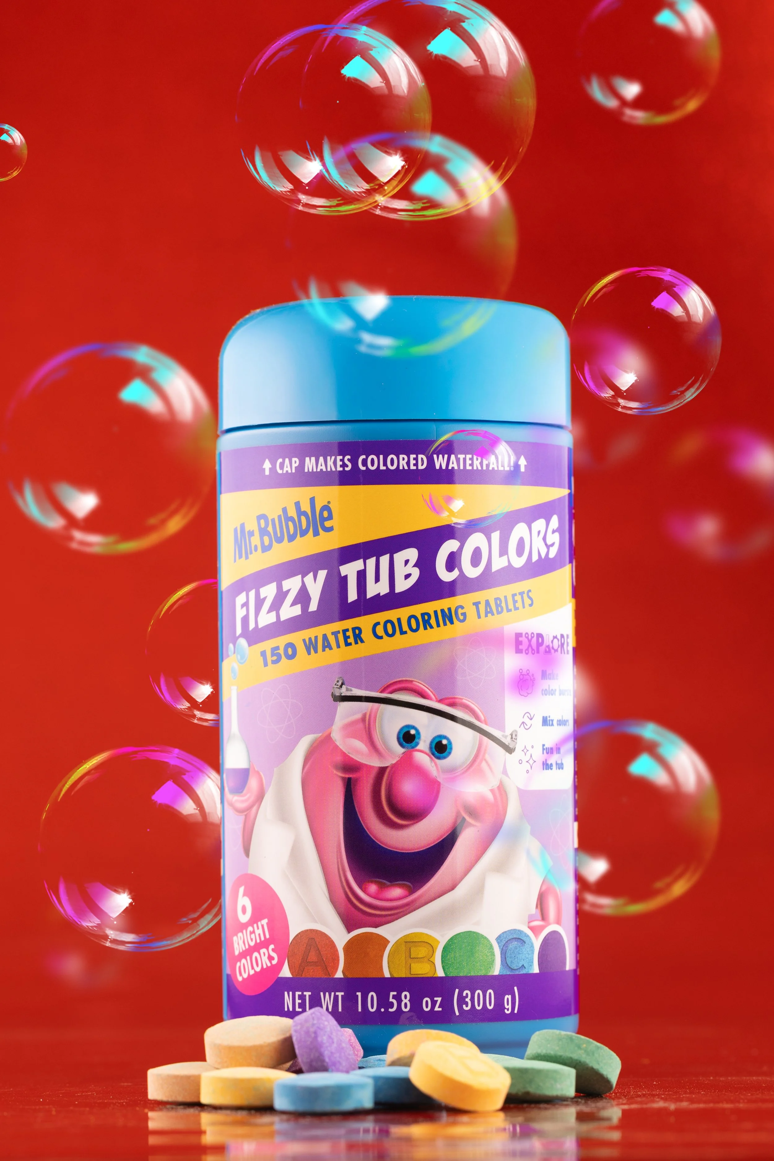
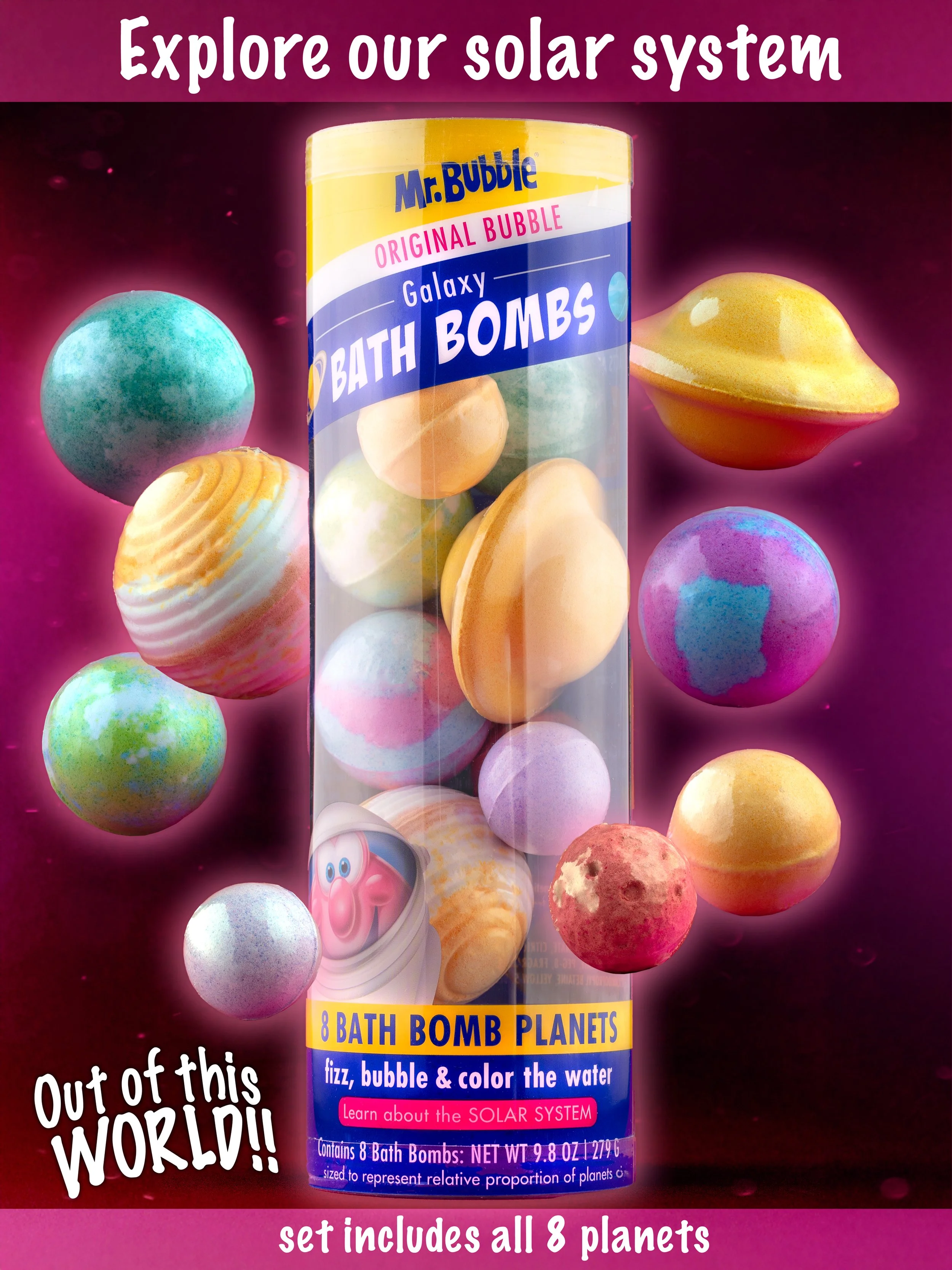
Mr. Bubble: Social Media
The Instagram image pulls in closer. Same bubblegum-bright world, but scaled for a phone screen and a scroll, where the product needs to read as fun and a little irreverent in under a second. Tighter crop, playful angle, bubbles doing the work that copy usually has to.
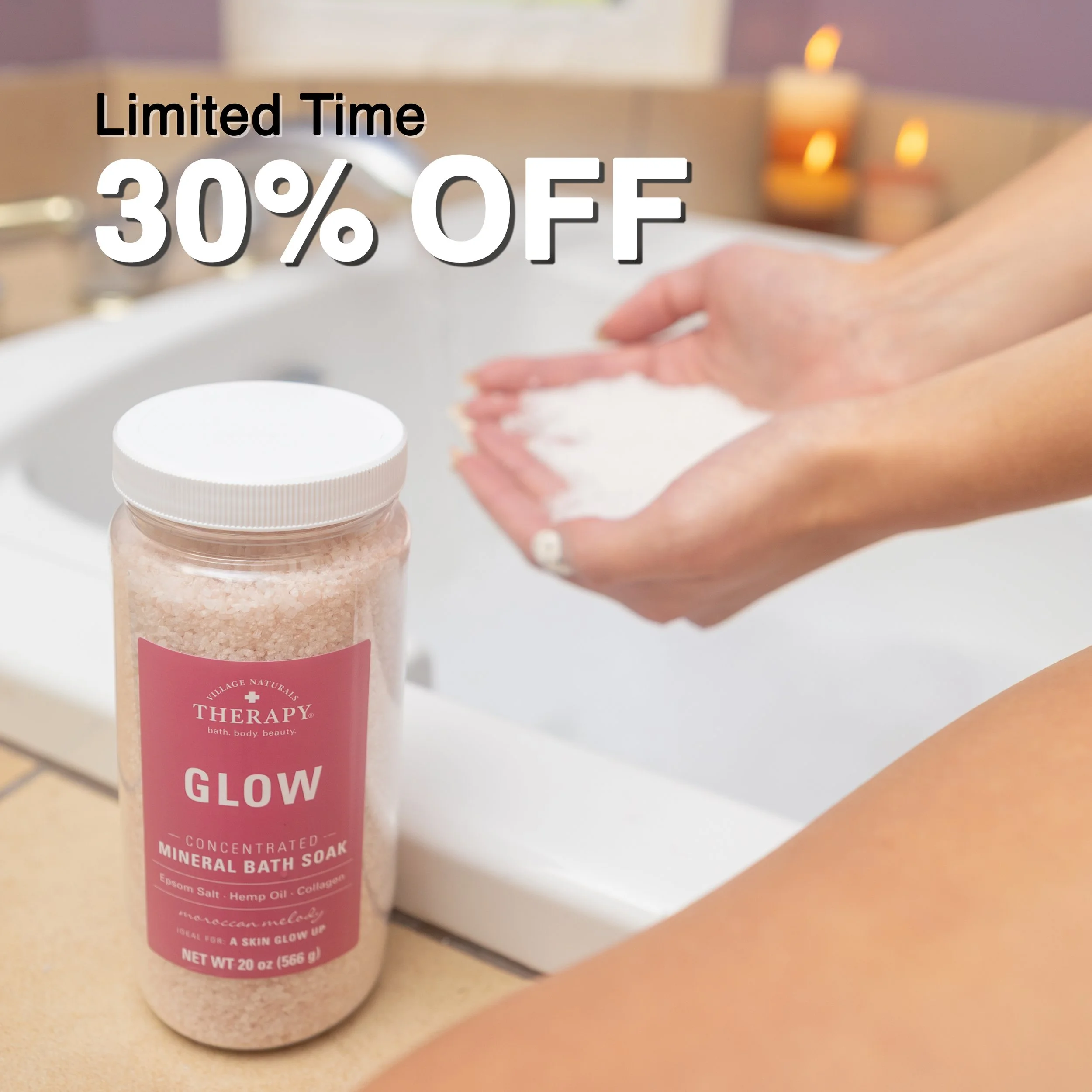
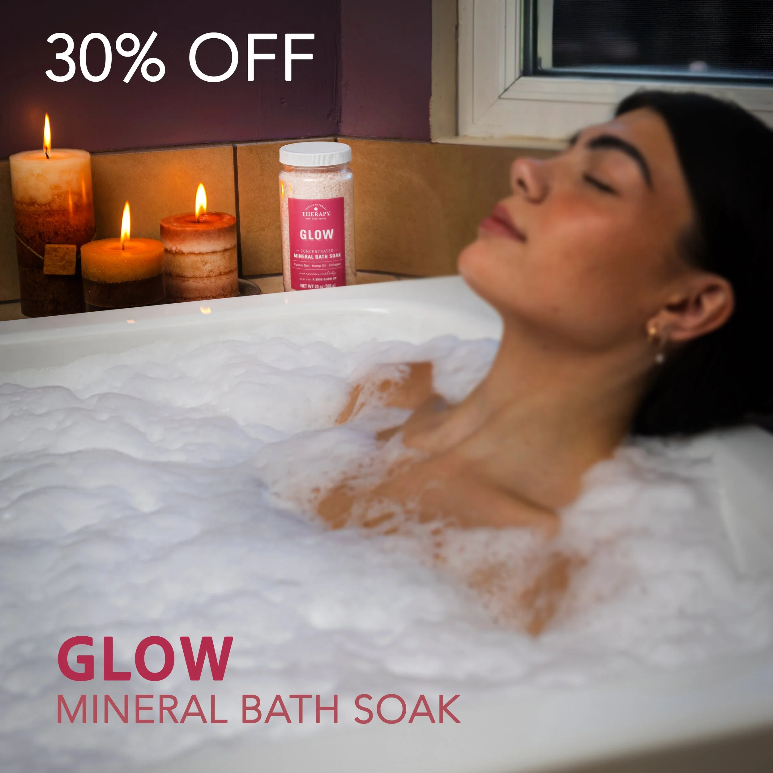
Village Naturals Therapy: Digital Advertisement
Therapy asks for the opposite instinct. Where Mr. Bubble is loud, Therapy is a held breath: soft candle light, muted natural tones, texture over color. The square format needed to carry a "30% OFF" promotional graphic without breaking that calm, so the composition builds in negative space from the start rather than bolting text on after the fact.
Two Brands, One Eye
Key Results:
Three deliverables built to spec across email, social, and digital ad formats
A demonstrated range across two distinct brand personalities within a single company
Full campaign built from everyday materials, with no prop or location budget